Nosferatu the Vampyre 1979 Study
One of my passions is to study and screenshot my way through films. By doing this I can study the camera angles, shadows, interesting lines created by set pieces, color to set mood or location, diegetic vs nondiegetic light sources etc. So much goes into film to pull off the magic or in this case the horror. The horror of the nosferatu. This is the German remake done in 1979 by Werner Herzog starring Klaus Kinski. Since most actors were bilingual on the production they filmed it in English and German simultaneously. I only prefer the German language version over the English because Renfield's laughs are a bit more crazed and maniacal (thus enjoyable). Enough with the intro, onto some of my findings!
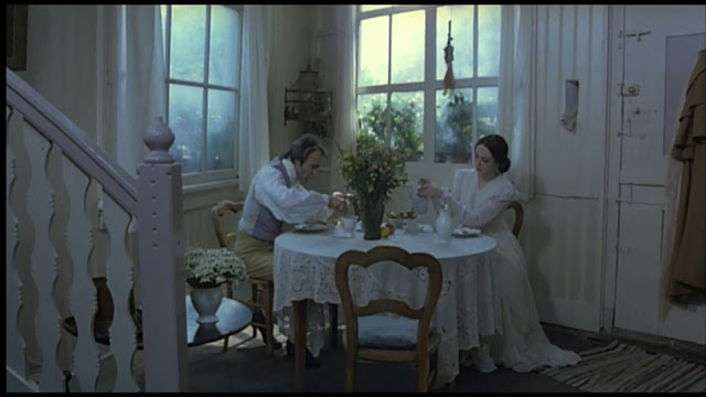
Here we start off near the beginning of the film. Everything is bright and open and white. The lighting is diffuse and ethereal. It gives off a heavenly vibe. This is everything is antithesis to what is to come. Before the dark horror and undead cursed souls.
One of my favorite shots from the film. Here we are with Mr. Harker at the castle meeting Count Dracula and sitting down to dinner. The shadows on the walls add an ominous feel and the high camera angle suggests that we see and know more than the main character at this point as he is being lead into a restrictive space. Dracula's head is clearly visible from the contrast of his pale skin and the dark of the wood behind him. Mr. Harker is a dark silhouette like his knowledge, a vague shape in the dark with nothing concrete to make judgement on yet.
Werner Herzog knows what he wants us to focus on and leaves out extraneous details like the backgrounds at times. This sharp contrast of the white and black with the sharpness of the light cut an imposing sight with nothing to distract your eye from the uncomfortable feeling the performance is giving off. The control of the falloff is impressive.
If what we are to focus on is a set piece then flags are used block the light into narrow shafts. The extreme shaping of the light in a few of these shots help heighten the otherworldly feeling of Castle Dracula. Darkness pervades and we are only shown what Dracula want's us to see.
I love lighting that is pretending to be diegetic. Here we have a lit candle on the desk and yet the signing of the contact for Dracula's new house is so important more light is used to spotlight the key moment. Mr. Harker is only lit in profile which gives some nice shaping to his face and helps sell that the lighting as actually coming from the candle. I wish my candles could burn that bright.
Spotlights stronger than the moon and a gradient on the back building help us "see in the dark" and follow the action with the important moving of the coffins.
Guess who's outside? It's Dracula! How can you tell? He's in the "moonlight." Since the days of silent films blue = night. Or more accurately, blue = moonlight. Here is an extreme example of color gels being used to tint lights so inside vs outside is blatantly obvious.
Alright, last one. No reflection! But to show the stalking danger and imminent threat shadows are used to show his presence. It's not physically correct for the lighting of the rest of the room, but it helps the story so it doesn't matter.
The End
Here we start off near the beginning of the film. Everything is bright and open and white. The lighting is diffuse and ethereal. It gives off a heavenly vibe. This is everything is antithesis to what is to come. Before the dark horror and undead cursed souls.
One of my favorite shots from the film. Here we are with Mr. Harker at the castle meeting Count Dracula and sitting down to dinner. The shadows on the walls add an ominous feel and the high camera angle suggests that we see and know more than the main character at this point as he is being lead into a restrictive space. Dracula's head is clearly visible from the contrast of his pale skin and the dark of the wood behind him. Mr. Harker is a dark silhouette like his knowledge, a vague shape in the dark with nothing concrete to make judgement on yet.
Werner Herzog knows what he wants us to focus on and leaves out extraneous details like the backgrounds at times. This sharp contrast of the white and black with the sharpness of the light cut an imposing sight with nothing to distract your eye from the uncomfortable feeling the performance is giving off. The control of the falloff is impressive.
If what we are to focus on is a set piece then flags are used block the light into narrow shafts. The extreme shaping of the light in a few of these shots help heighten the otherworldly feeling of Castle Dracula. Darkness pervades and we are only shown what Dracula want's us to see.
I love lighting that is pretending to be diegetic. Here we have a lit candle on the desk and yet the signing of the contact for Dracula's new house is so important more light is used to spotlight the key moment. Mr. Harker is only lit in profile which gives some nice shaping to his face and helps sell that the lighting as actually coming from the candle. I wish my candles could burn that bright.
Recreation of the classic shot from the silent film from 1922. Similar coloring as the hand dyed cells from that scene as well that simulated nighttime. Two soft spotlights on the two actors. That corner of the room can fall into complete darkness.
Yet another "candle lit" shot. Love the circular composition too from the central figures. Another shot where flags were used to cut off the light. Looks like a renaissance painting.
Super cool upshot of Dracula on the ship stalking the crew. Sharp spotlight lighting from underneath help with the eerie situation. The lines of the rigging and mast also help add visual interest and a visual reminder of where we are.
Spotlights stronger than the moon and a gradient on the back building help us "see in the dark" and follow the action with the important moving of the coffins.
Guess who's outside? It's Dracula! How can you tell? He's in the "moonlight." Since the days of silent films blue = night. Or more accurately, blue = moonlight. Here is an extreme example of color gels being used to tint lights so inside vs outside is blatantly obvious.
Alright, last one. No reflection! But to show the stalking danger and imminent threat shadows are used to show his presence. It's not physically correct for the lighting of the rest of the room, but it helps the story so it doesn't matter.
The End


Comments
Post a Comment