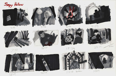
Storyboard Studies: Sleepy Hollow
I watched the film Sleepy Hollow by Tim Burton and did some quick thumbnail studies of the compositions and contrast in a few shots. I used pencil and Prismacolor markers. I love this movie. The use of low tone in the main body of the film and high tone during flashbacks caught my attention as did the use of desaturation. There were no browns until the after the resolve of the plot is just one among other conscious cinematic decisions present in this film.


Comments
Post a Comment